Make sure you read to the bottom…
Quite an eye opener…
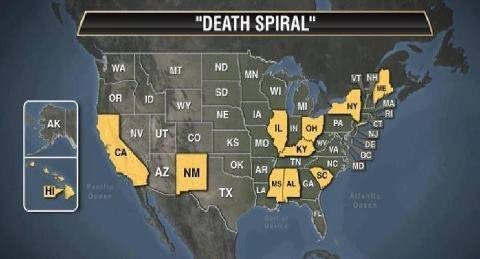
These 11 States now have More People on Welfare than they do Employed!
Last month, the Senate Budget Committee reports that in fiscal year 2012, between food stamps, housing support, child care, Medicaid and other benefits, the average U.S. Household below the poverty line received $168.00 a day in government support. What’s the problem with that much support? Well, the median household income in America is just over $50,000,which averages out to $137.13 a day. To put it another way, being on welfare now pays the equivalent of $30.00 an hour for a 40-hour week, while the average job pays $20.00 an hour.
Furthermore:
There are actually two messages here. The first is very
interesting, but the second is absolutely astounding – and explains a lot.
A recent “Investor’s Business Daily” article provided very
interesting statistics from a survey by the United Nations International Health Organization.
Percentage of men and women who survived a cancer five years
after diagnosis:
U.S. 65%
England 46%
Canada 42%
Percentage of patients diagnosed with diabetes who received
treatment within six months:
U.S. 93%
England 15%
Canada 43%
Percentage of seniors needing hip replacement who received it
within six months:
U.S. 90%
England 15%
Canada 43%
Percentage referred to a medical specialist who see one within
one month:
U.S. 77%
England 40%
Canada 43%
Number of MRI scanners (a prime diagnostic tool) per million
people:
U.S. 71
England 14
Canada 18
Percentage of seniors (65+), with low income, who say they are
in “excellent health”:
U.S. 12%
England 2%
Canada 6%
And now for the last statistic:
National Health Insurance?
U.S. NO
England YES
Canada YES
Check this last set of statistics!!
The percentage of each past president’s cabinet who had worked
in the private business sector prior to their appointment to the cabinet. You know what the private business sector is; a real-life business, not a government job.
Here are the percentages.
T. Roosevelt……………….. 38%
Taft………………………….. 40%
Wilson ……………………… 52%
Harding……………………… 49%
Coolidge……………………. 48%
Hoover………………………. 42%
F. Roosevelt………………… 50%
Truman……………………… 50%
Eisenhower……………. …. 57%
Kennedy……………………. 30%
Johnson…………………….. 47%
Nixon………………………… 53%
Ford………………………….. 42%
Carter……………………….. 32%
Reagan………………………. 56%
GH Bush…………………….. 51%
Clinton …………………….. 39%
GW Bush…………………… 55%
Obama……………………….. 8%
This helps to explain the incompetence of this administration:
only 8% of them have ever worked in private business! That’s right! Only eight percent—the least, by far, of the last 19 presidents! And these people are trying to tell our big corporations how to run their business?
How can the president of a major nation and society, the one with the most successful economic system in world history, stand and talk
about business when he’s never worked for one? Or about jobs when he has never really had one? And when it’s the same for 92% of his senior staff and closest advisers? They’ve spent most of their time in academia, government and/or non-profit jobs or as “community organizers.” They should have been in an employment line.
Pass this on because we’ll NEVER see these facts in the main
stream media.
